11 Beautiful Websites to Get Inspiration From
People judge the appearance of your website within 50 milliseconds. After this timespan, which passes more quickly than the blink of an eye, the opportunity to make a first impression again is gone.
Your visitor will either find your site attractive or unattractive. Or they might be completely indifferent to your design, which is possibly an even less desirable outcome than them finding it ugly.
Whatever the case may be, you've ended up at this article because you're (probably) looking for inspiration for your own website. While the internet is jam-packed with beautiful websites, you have to dig through the rubble to find them. I've done that for you.
In this overview, I'll showcase beautiful websites of all shapes and sizes. Travel websites, ecommerce sites, blogs. I'll explain why I find these sites so appealing. Then I'll highlight several elements from these sites that you could “borrow” for your own website project.
11 Beautiful website examples
1. AirBnB
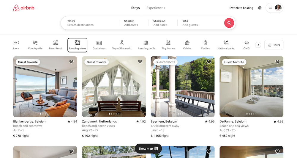
Website type: Travel platform
What makes this website beautiful?
I'll be completely honest: in my previous life as a startup CEO, I borrowed design ideas more than once from AirBnB (both their app and website). Although my team and I never managed to make our product (a restaurant reservation app) as beautiful as AirBnB, we still left our direct competitors in the dust.
AirBnB was founded by designers. This shows. The design is minimalistic, allowing the beautiful photos of properties to do most of the heavy lifting – exactly as it should be for a site like this. They use a consistent typeface and make clever use of icons, making it easy to absorb information.
Elements you can “borrow”:
- Subtle rounded corners on your images that give your site a slightly softer appearance
- Use a maximum of two or three colors on your website
- A product overview that spans the full width of your screen
2. Slack
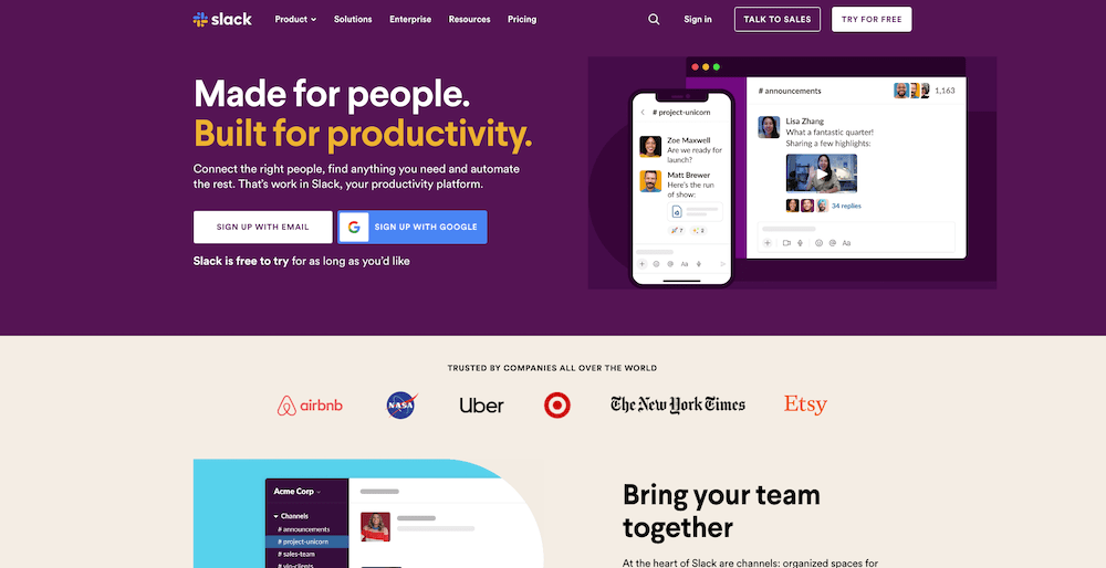
Website Type: Software as a Service (SaaS)
What makes this website beautiful?
Beautiful pastel colors that blend together perfectly. Subtle animations that make the homepage just a bit more lively.
Work chat software is fundamentally boring. Slack manages to make it exciting through their use of color and playful design.
Elements you can “borrow”:
- Display a row of companies you work with directly on your homepage
- Use an eye-catching CTA color
- Subtle animations
3. PirateCode
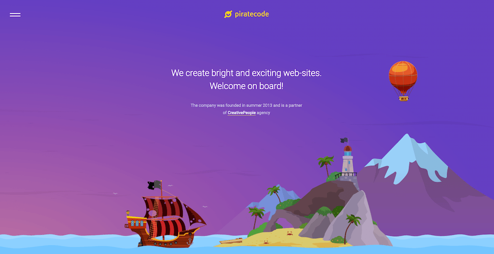
Website Type: Web Design Agency
What makes this website beautiful?
You'd expect a web design agency to have a stunning website, but many miss the mark. Not PirateCode, which steals the show with beautiful full-screen images, accessible typography, and incredible animations (check out that crocodile casually waddling from left to right with a soft drink in hand!).
Elements you can “borrow”:
- An overarching site theme that sparks the imagination
- Unique, hand-drawn illustrations
- No rigid dividing lines between different website sections, but rather lines that form bubble-like shapes or curves
4. WireCutter
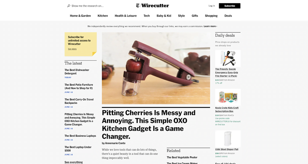
Website Type: Affiliate website
What makes this website beautiful?
It helps if you, as an affiliate site, have access to the design team of The New York Times. When WireCutter was sold for millions to one of the largest newspapers in the world, the quality of its design certainly didn't suffer.
A subtle gray background, bold black lines above the headings, and crisp product images help create a design that inspires confidence as you browse through it.
Elements you can “borrow”:
- The product boxes on their product comparison pages (which have admittedly already been borrowed by roughly half of the affiliate marketing community, but oh well)
- Strongly contrasting colors of their fonts
- Affiliate links that are bright red, with all other links remaining black
5. De La Calle
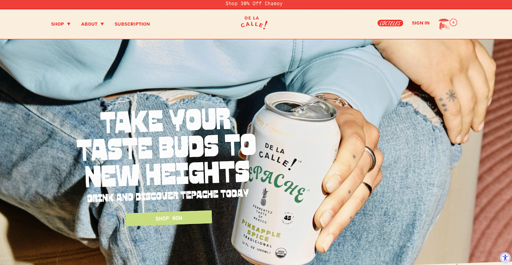
Website type: Ecommerce
What makes this website beautiful?
De La Calle is a website whose colors perfectly align with the company's branding. This also applies to the typography, which immediately makes you thirsty for one of their delicious Mexican soft drinks.
The website uses as many colors as they have soft drinks – nine in total – but at no point does this abundant use of color feel overwhelming.
Elements you can “borrow”:
- Text with a slight slant that gives your site a more playful look
- Bold fonts that venture off the beaten path
- A CTA color that changes to its opposite when you hover your mouse over it
6. Switch Research
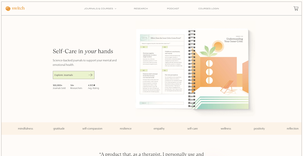
Website type: Ecommerce
What makes this website beautiful?
Switch Research features a calming design that perfectly complements the site's subject matter. Light colors, an elegant typeface, and subtle animations all work together seamlessly.
The website is an e-commerce store but never feels pushy or overly sales-oriented.
Elements you can “borrow”:
- Gradient colors for a background consisting of not two but 3 different colors
- Thin 1-pixel lines that mark different sections of your website
- Words related to your business that scroll across the screen from left to right
7. Too Good To Go
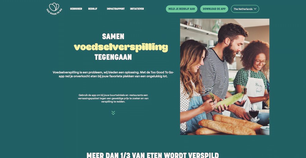
Website type: Two-sided marketplace
What makes this website beautiful?
Too Good To Go is committed to fighting food waste. The site reinforces this mission through its attractive green and yellow color scheme. The minimalist design completely focuses your attention on the company's message.
Elements you can “borrow”:
- Emphasize parts of your text by using a different color
- Icons that gently wiggle to draw attention to statistics
- Generous use of white space giving your site an open, airy feel
8. Sonja van Duelmen
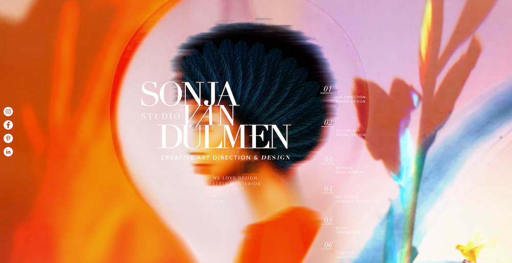
Website type: Portfolio
What makes this website beautiful?
The images by Sonja van Duelmen grab you by the collar and don't let go. It's difficult to tear your eyes away from the visual feast that the site unleashes on you, which is exactly the point for a creative designer.
Sonja also uses animations in a creative, unique way that you practically never see elsewhere.
Elements you can “borrow”:
- Eye-catching images with colors that pop off the screen
- Photos that are mostly static but contain a single, simple animation
- Keep your website only black and white when you have colorful images that need to take center stage
9. Sirin Labs
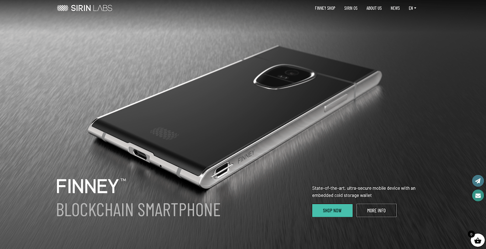
Website type: Ecommerce
What makes this website beautiful?
I'm not linking to the Sirin Labs website because it's a blockchain/crypto product (which I despise), but I still want to highlight them for their design. The site showcases excellent product photography and proves that photography and illustration can work perfectly together.
Elements you can “borrow”:
- A creative grid layout (3 blocks side by side, with two blocks underneath)
- Mouthwateringly beautiful product photos
- Mixture of high-resolution photos and illustrations
10. Wait But Why
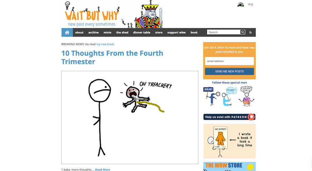
Website type: Blog
What makes this website beautiful?
I can already hear you thinking: what on earth is beautiful about this monstrosity of a site that looks like it was plucked straight out of the 1990s?
And to be completely fair, most other bloggers wouldn't include Wait But Why in a roundup of “beautiful websites”.
The reason why it's in this list isn't because Wait But Why is beautiful in the classical sense of the word. The reason is that through its unique, hand-drawn illustrations, playful interpretation of social media icons, and incredibly simple layout, you get a site that stands head and shoulders above the cookie-cutter sameness of the worldwide web. The beauty of the site lies in its courage to be unique.
It's a site you won't forget or confuse with another site.
Elements you can “borrow”:
- If you have any creative talent, self-drawn illustrations
- A sidebar that makes your visitors smile
11. High St. Deli
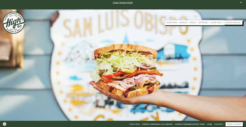
Type of website: Restaurant site
What makes this website beautiful?
Life-sized photos of sandwiches, creatively designed menus, and a consistent color palette. High St. Deli serves as an excellent example for casual restaurant websites.
Elements you can “borrow”:
- Shadow menu without blur
- Large food photos that take up half or entire pages
Principles of good website design
Below you'll find several universal design principles that every well-designed website should follow.
Keep it simple
Remember: less is more. Simplicity should be the primary goal of website design.
No matter how tempting it is to add all kinds of frills and effects to your site, always keep your user in mind. How can you present the information they're looking for in the simplest, clearest way possible? Will their user experience actually improve with a variety of different colors, content blocks, and other elements competing for their attention?
Don't make your users think
Or, “don't make me think!” in Steven Krug's words. Krug's book on this subject is decades old but still very relevant in 2025.
When designing your website, it's your responsibility to eliminate any confusion for your visitors. You can achieve this by creating a clear visual hierarchy, logical navigation, and consistency in design elements.
Text plays an enormously important role here too: is there any ambiguity in the words you use on your website? Is your copywriting as sharp and clear as it could be?
Draw your users' attention to what matters most
This relates to the previous point. Use color contrast or size differences to guide your visitors' attention to specific elements of your site. This makes it easy to lead them from point A to point B without requiring any effort on their part.
Use a lot of white space
Your site will be much easier to digest when you add plenty of white space between your design elements and text.
White space gives web pages a sense of spaciousness and provides your visitors with moments to breathe. One of the first things visitors do is scan your page and mentally divide the information into easily digestible chunks. White space makes this process much simpler.
Originality is fine, but don't stray too far from the beaten path.
The internet would be an impossible place to navigate if websites abandoned established design conventions.
Just like in real life (for example, most airports follow a similar blueprint), users on the internet also expect a certain predictability when visiting a website. Think about a navigation menu at the top of the site, how an average blog post is structured, and what a contact page looks like.
Originality is great, but make sure your site doesn't stray too far from the norm. Follow design conventions that people are familiar with.
How to build your own website?
Not quite sure yet how you'll put your website together? Check out one of these articles:
TIP: Give your website a kickstart with a WebsiteGecko WordPress theme. This will save you weeks or months of struggling with your design.